|
Using Analysis Report
When using an Analysis Report, any user can interact with this report to "mold" it to their requirement, if necessary.
Some of those options will depend on the current display type of the information.
Options always available - regardless of the Display Type
The following interactions are always available for users, regardless of the information currently being shown in a tabular form, or as a graph.
If you want to ...
|
Perform these steps ...
|
Change the output type of the current information.
|
In the top right corner, select the Actions Button, and then:
Actions  Show Reports as Table/Chart, and then select your output type: Show Reports as Table/Chart, and then select your output type:
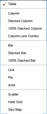
- The current selection will be marked with a tick.
- NOTE:
When changing from Table to Chart, not all of the listed Chart types may be suitable, because the current data is not structured correctly.
If this is the case, the system will show a message that fields need to be dragged into the required layout zone - a task which is not accessible for report consumers.
|
Remove a filter
|
You can tell when a filter is currently applied when, in the top row of the reporting window, you can see a line like "1 Filter".
To show the filter, you may have to click on the "+" symbol to the left of this line. Once the filter(s) are visible, you can remove it by clicking on the "x" symbol.
- NOTE:
- the filter will only be removed for the current session. It will not affect other users.
- to re-add the filter, the user will have to close the report, and open it again.
|
Export the report
|
At any stage, you can export the report in either Excel, or PDF format. Depending on the report, and the user's interaction with the report in the current session, the export includes:
- The report in the table format.
- The report as a chart.
- Some report details.
Each of these will be exported with the content and the format as just viewed prior to exporting.
|
Options available in TABLE view
The following interactions are only available for users when the report is shown in a tabular form.
If you want to ...
|
Perform these steps ...
|
Add or Remove TOTALS for Rows or Columns.
|
In the top right corner, select the Actions Button, and then add or remove your selection from Show Grand Totals for Rows or Columns.
|
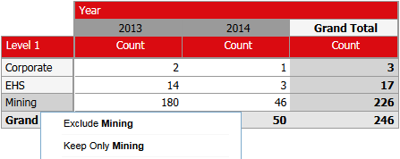
Apply additional filters to the report.
|
In a table view, an end user has the following options to further filter the currently available information:
- EXCLUDE a column or a row
- INCLUDE ONLY the selected column or row
- Revert any of the above selection to again SHOW ALL
This can be done by right-clicking on a column value, or a row value, and select the required action.
|
Drill down into a row or column.
|
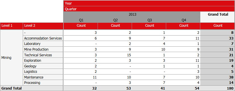
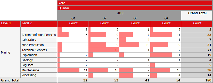
If your report contains information which is "hierarchical", then you will be able to "drill down" to the next level.
You will know if the value can be drilled down into when, while hovering over a value in the column row, you can see "Double click to show [next level]".
When you start to drill down, the system will
- Apply a filter to INCLUDE ONLY the selected row or column.
- Reveal the next level.
- Automatically re-calculate any totals which may be included in the report.
In the above example, rows and columns are both hierarchical, and after "drilling" into Level 2 = Mining and the year 2013 (with the next level being Quarters), the report will look like this.
|
Revert a drill down
|
You can revert back to the original state of the report simply by re-loading it.
However, you can also manually go back to the previous state by performing the following two steps:
- To remove the filter which was added:
Select the filter which were added by the drill down, and remove them. In the above example, these would be "Level 1 includes Mining", and "Year includes 2012". - To move "up" one level:
right-click an the corresponding row or column label. In the above example that would be "Level 2" or "Quarter"), and then select Remove from Report.
|
Change the sorting order.
|
Right-click on the column you intend to sort, a select the required sort order. You will have the options of:
- Sort A ? Z, or Z ? A (for columns containing a text field)
- Sort Values High ? Low, or Low ? High (for columns containing a numerical field)
|
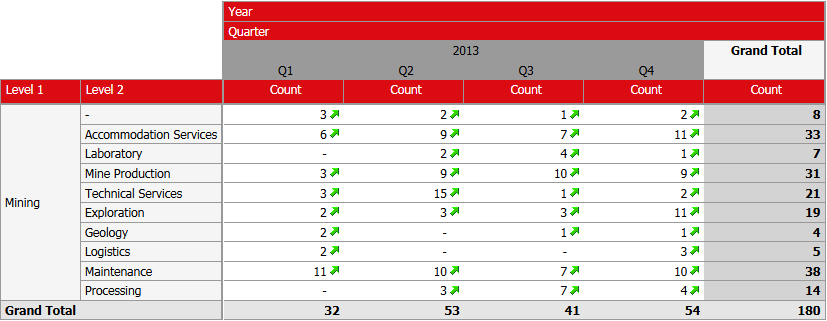
Apply conditional formatting.
|
To emphasis information, or to make it easier to see information at a glance, you can apply conditional formatting. The options are:
- Color Scale:
changes the background color of each cell, for example from Green ? Yellow ? Red, or in the inverse order.
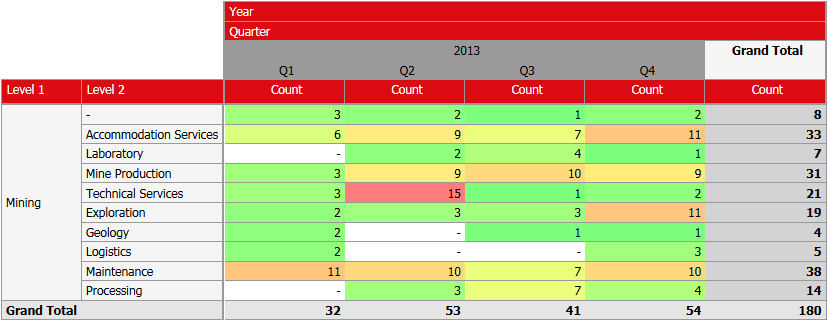
- Data Bar:
the higher the value, the longer the bar shown in each cell.
- Trend Arrow:
An upward or downward arrow is displayed to the right of the cell value depending on whether it contains a positive or negative value.
|
Options available in CHART view
The following interactions are only available for users when the report is shown as a chart.
If you want to ...
|
Perform these steps ...
|
Change the Chart type.
|
See above.
|
Apply additional filters to the current report.
|
In a chart view, an end user has the following options to further filter the currently available information:
- EXCLUDE some values
- INCLUDE ONLY some values
This can be achieved simply selecting those entries which need to be included/excluded from either
- the legend (e.g. when using a Pie chart)
- axis labels (e.g. when using a Bar or Column chart)
You can select individual entries by clicking on them, or by dragging a box while keeping the mouse button pressed over a range of entries.
Once a selection has been made, you can opt to EXCLUDE, INCLUDE or CLEAR the current selection.
While in the process of selecting items:
After selecting to "Keep only" the selected items:
|
Drill down to the next level.
|
If your chart contains information which is "hierarchical", then you will be able to "drill down" to the next level.
You will know if the value can be drilled down into when, while hovering over a value in the column row, you can see "Double click to show [next level]".
When you start to drill down, the system will
- Apply a filter to INCLUDE ONLY the selected segment.
- Reveal the next level.
- Automatically re-calculate any values which may be included in the report.
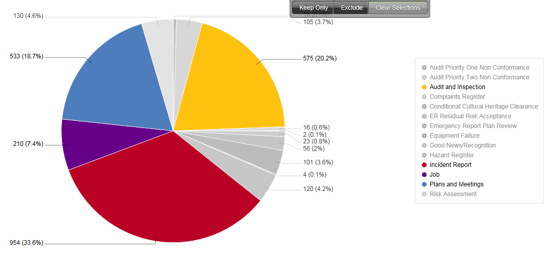
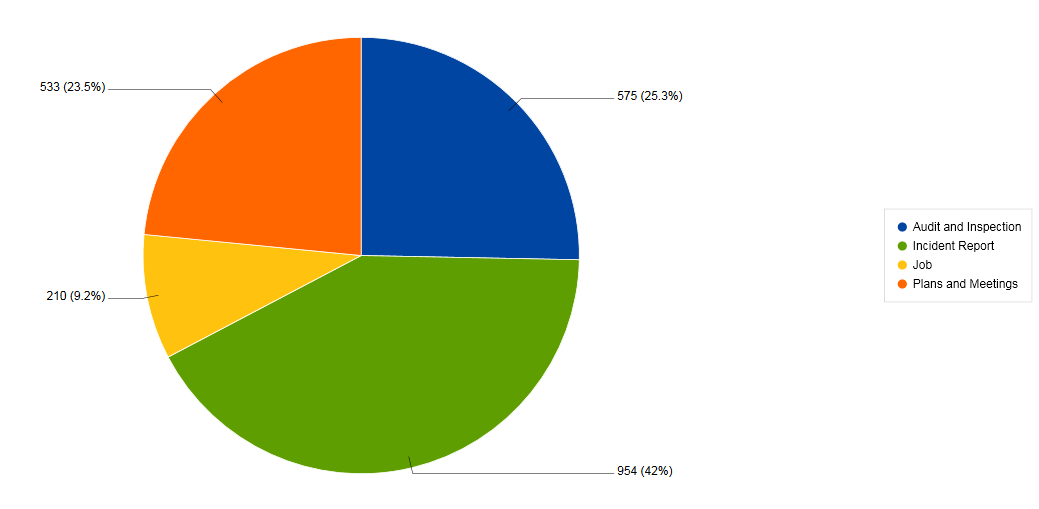
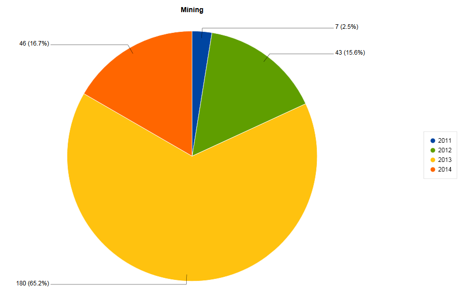
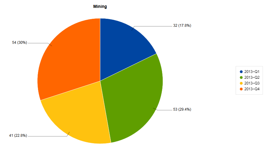
The following chart allows the user to drill down from Year ? Quarter ? Month by double-clicking on the required segment.
Chart shows years 2011 to 2014:
User has drilled down to year 2014, showing Q1 to Q4 of this year:
|
Revert a drill down
|
You can revert back to the original state of the report simply by re-loading it. However, you will loose any changes you have made so far.
However, you can also manually go back to the previous state by performing the following two steps:
- To remove the filter which was added:
Select the filter which were added by the drill down, and remove them. In the above example, these would be "Level 1 includes Mining", and "Year includes 2012". - To move "up" one level:
You will need to switch back to the "table" view, and then right-click an the corresponding row or column label. In the above example that would be "Quarter", and then select Remove from Report. - After that, you will need to revert back to the chart view.
|
|
