Basic Elements

Name

  • Enter in a unique name for your visualization.

Data Source

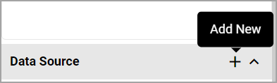
  • Click on the Add New button to add a data source. In the dialog that opens, select a 'Component' which is the source of your visualization, enter in a name for the 'Data Source'. The system will display the columns that are defined in the Visualization Data Source List View defined for that component in Component Management Menu path separator Select the Component Menu path separator Visualizations. If that field is blank, the system will display the columns defined in the default component lookup defined for that component.
  • You can add or remove columns to this list view using the Add/Remove Columns button and apply filtering on the columns like you can in a list view, e.g., apply a filter on the Incident Date column to return Incidents occurred in the past 12 months.
  • You can configure advanced filters or add in fields that are hidden from the Form using the Advanced Filter and Advanced View options respectively.
  • You can add in multiple data sources by hovering over the Data Source section and clicking on + which will open the dialog where you can select the Component for your next data source.

Visualization_Add New Data Source

Title (optional)

Enter in a title to provide context for your visualization.

Chart Type

The following Chart Types are available for your visualization:

  • Bar Chart
  • Bar Chart - Stacked
  • Line Chart
  • Map Chart
  • Number Tile
  • Pie Chart
  • Table Chart
  • Word Cloud

Return to Visualizations

Category (X-Axis)

For every data source present, you will be displayed with the list of available fields that you can select to categorize your data. This field will be your X-axis for your bar/line/table charts. Where there are multiple data sources, it is logical to select the same type of field for the Category in all data sources.

If you are looking at trends by Month/Year, then select a Date field to be the Category in all your data sources or if you are looking at trends by Location, then select Location to be the Category in all your data sources.

For hierarchical component lookups, like, Location and Department, you will have to option to select the Level of the hierarchy. Selecting Level 3 for a location level would mean that the chart will return records at Location level 3 and its children.

The following field types are available for Category selection:

  • Date fields
  • Lookup fields -single and multi-select lookups
  • Hierarchical Component Lookups -Single
  • Component Lookups (where the Component is set to be used for Category/Dimension in Component Management)
  • Status fields

You can edit your Category by simply clicking on a different available field in the Category list or you can hover over the section header and click on the x button to clear your selection.

At any point, you can go back and edit your data source to add in additional fields to your list view and it will be reflected in the Visualization editor.

Visualization_Category X-axis

Return to Visualizations

Measures (Y-Axis)

For every data source present, once an applicable Category has been selected, the system will display a "Count" measure, at a minimum. You can tick the checkbox next to the Measure name and it will be reflected in the chart canvass, you can tick multiple measures (based on the Chart Type).

If your data source columns include numeric fields, additional measures like, Sum, Average, Max and Min are available.

Visualization_Measures

Visualization - Measure Options

Clicking on the pencil icon next to the Measure name will load a dialog box where you can update it.

Name

Name of the Measure

Decimal Places

The number of decimal places that will be shown.

This is mainly useful for number-tiles and Table Charts.

Defaulted to 2-decimal places.

Show empty points a (for Line Charts)

Null Values - This is the default selection, system will display 'gaps' in the chart for empty points/measure values.

Zero values - Selecting this option will plot zero values when no data is returned.

Connect with a line - Selecting this option will display the chart as a continuous line connecting to the next the data point.

Show in separate Y-axis

Ticking this option will display that measure in a separate Y-axis. This is particularly useful when there are multiple datasets and the Y-axis ranges are on varies scale/ranges.

If a chart has multiple measures, you can enable this option for one of those measures.

This option is applicable for Line/Bar chart types.

Calculated Measures

You can setup Calculated Measures by clicking on the + next to the Calculations section header which will load up the Calculations dialog.

  • Specify a name for your Calculated Measure
  • You will see the list of Measures grouped by the data source available to build your calculation. Click on them and it will be added to your Calculation field and you can perform basic mathematical operations like +, - , *, / and you can use brackets.
  • Click on Update and the newly created Calculated Measure will be available under the "Calculation" section header. You can tick the checkbox next to the Measure name to apply the Measure to the visualization.
  • Click on the pencil icon next to the Calculated Measure name to edit it.
  • Click on the x icon next to the Calculated Measure name to remove it.

Frequency Rate Calculations

To support rolling average frequency rate calculations, the SumPastPeriod function has been introduced to Calculated measures.

SumPastPeriods function takes two parameters,

  • a Measure to be summed.
  • and the number of past periods sum up the Measure for.

For example, creating a calculated measure "InjLast12Mths" with the following formula

SumPastPeriods([Injury (Count)],12)

and displaying it on a chart with Incident Date (Month) as Category, will mean that the value shown in the chart for each month will be the sum of the Injury count for that month plus the Injury counts for the previous 11 months:

  • January 2023 will show the sum of all "Injury (Count)" values from February 2022 through to and including January 2023
  • February 2023 will show the sum of all "Injury (Count)" values from March 2022 through to and including February 2023

Changing the Category from "Incident Date (Month)" to "Incident Date (Year)" will mean that the value shown in the chart for each Year will be the sum of the Injury count for that year plus the Injury counts for the previous 11 years.

From here it is possible to produce a typical Injury Frequency Rate Calculation as follows:

Visualization_FR Calculation

Example of a Frequency Rate 12 Month Rolling Average Calculated Measure

Visualization_Frquency Rate

Map Charts

  • Map charts great Location aware components or you can add in latitude/longitude to your data source columns.
  • Map charts require a Google API key to be setup (in the Global settings).
  • Note: When visualizing Map Charts and Number Tiles Charts, you can only select a single measure.

Word Cloud

  • An image composed of words used in a particular text field, in which the size of each word indicates its frequency or importance.
  • When Word Cloud is selected as a Chart Type, the system will display a Keyword Fields section header which will list the fields that have language processing setup.
  • You can choose to increase the Number of Words displayed in Word Cloud from 50 (which is the default) to 100 or 200.

Return to Visualizations

Series

For every data source present, the system displays the list of available fields that can be used to add a layer of categorization to your data. This is applicable for Bar and Line chart types.

Field types like Lookups (single and multi-select) and component lookups (single select hierarchical and regular component lookups) are available to be selected as Series.

You can clear a Series selection by clicking on the x next to the data source name under Series section header.

Return to Visualizations