|
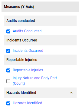
Measures (Y-Axis)
For every data source present, once an applicable Category has been selected, the system will display a "Count" measure, at a minimum. You can tick the checkbox next to the Measure name and it will be reflected in the chart canvas, you can tick multiple measures (based on the Chart Type).
If your data source columns include numeric fields, additional measures like, Sum, Average, Max and Min are available.
Clicking on the pencil icon next to the Measure name will load a dialog box where you can update it.
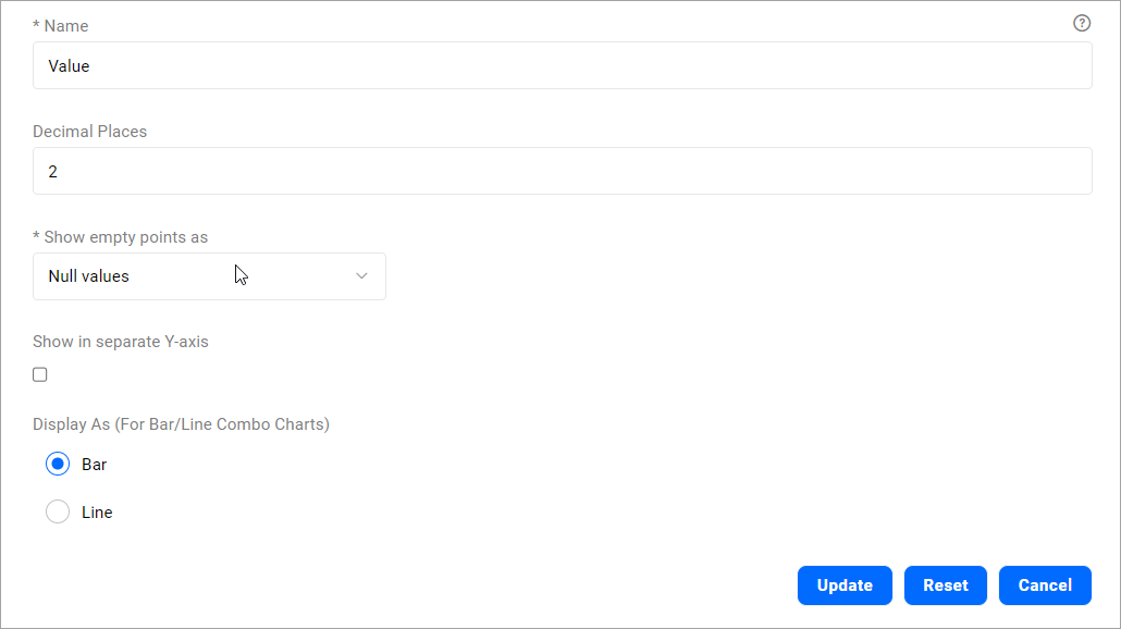
Name
|
Name of the Measure
|
Decimal Places
|
The number of decimal places that will be shown.
This is useful for number-tiles and Table Charts.
Defaulted to 2-decimal places.
|
Show empty points as
|
Null Values - This is the default selection, system will display 'gaps' in the chart for empty points/measure values.
Zero values - Selecting this option will plot zero values when no data is returned.
Connect with a line - Selecting this option will display the chart as a continuous line connecting to the next the data point.
Only visible for Bar and Bar/Line Chart types.
|
Show in separate Y-axis
|
Ticking this option will display that measure in a separate Y-axis. This is particularly useful when there are multiple datasets and the Y-axis ranges are on varied scale/ranges.
If a chart has multiple measures, you can enable this option for one of those measures. Only one measure can be selected to be shown in a separate Y-axis.
This option is applicable for Line/Bar chart types.
|
Display As (For Bar/Line Combo Charts)
|
This option is only applicable for Bar/Line combo chart type providing users with the flexibility to choose how they would like to display their measures – either as a bar or a line.
By default, for a Bar/Line chart, the system will display the last selected measure as a line.
|
Note: You can only select a single measure for Map Charts, Number Tiles, Pie Charts and Heatmaps
Calculated Measures
You can setup Calculated Measures by clicking on the + next to the Calculations section header which will load up the Calculations dialog.
- Specify a name for your Calculated Measure
- You will see the list of Measures grouped by the data source available to build your calculation. Click on them and it will be added to your Calculation field and you can perform basic mathematical operations like +, - , *, / and you can use brackets.
- Click on Update and the newly created Calculated Measure will be available under the "Calculation" section header. You can tick the checkbox next to the Measure name to apply the Measure to the visualization.
- Click on the pencil icon next to the Calculated Measure name to edit it.
- Click on the x icon next to the Calculated Measure name to remove it.
Frequency Rate Calculations
To support rolling average frequency rate calculations, the SumPastPeriod function is available in Calculated measures.
SumPastPeriods function takes two parameters,
- a Measure to be summed.
- and the number of past periods sum up the Measure for.
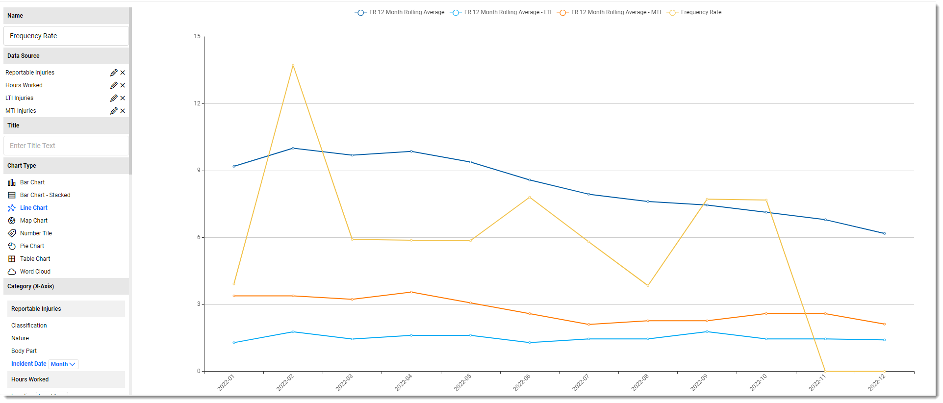
For example, creating a calculated measure "InjLast12Mths" with the following formula
SumPastPeriods([Injury (Count)],12)
and displaying it on a chart with Incident Date (Month) as Category, will mean that the value shown in the chart for each month will be the sum of the Injury count for that month plus the Injury counts for the previous 11 months:
- January 2023 will show the sum of all "Injury (Count)" values from February 2022 through to and including January 2023
- February 2023 will show the sum of all "Injury (Count)" values from March 2022 through to and including February 2023
Changing the Category from "Incident Date (Month)" to "Incident Date (Year)" will mean that the value shown in the chart for each Year will be the sum of the Injury count for that year plus the Injury counts for the previous 11 years.
From here it is possible to produce a typical Injury Frequency Rate Calculation as follows:
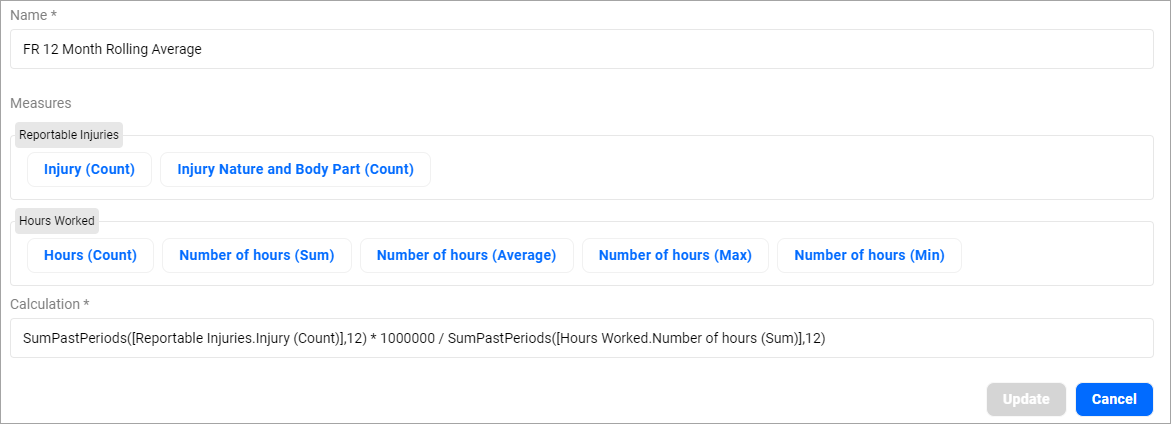
Example of a Frequency Rate 12 Month Rolling Average Calculated Measure
|
