|
Advanced Options
Advanced options allow you to define additional elements for a Visualization, such as colors, axis titles, sorting and translations.
Chart Options
|
Color Palette
|
Allows you to override the default color palette, giving the visualization a specific color theme.
Supply a comma separated list of values colors in HEX format.
Example:
#1b3bab,#e34954,#fc9508,#88d18d,#f8a0a7,#fced3a,#f2d118,#bed144,#d5b751
The visualization will apply these colors to the bars/lines/slices etc.
The system will use the colors defined in the Global Settings if there are no colors defined here.
|
Color Map
|
Use this option to assign specific colors to specific values.
Color Map accepts the color definitions in text, hex codes and rgb. Example:
"Major":"rgb(220, 20, 60)"
"Moderate":"Blue",
"Minor":"Teal",
"Insignificant":"Green",
"Not Applicable":"#7393B3"
The system looks at the "Text" in the color map and displays the chart colors accordingly. So where the Web Application is internationalized, specify the relevant lookup text items and the color code.
Example:
"Insignificant":"Green",
"Insignifiant":"Green",
"Not Applicable":"#7393B3",
"N'est pas applicable":"#7393B3",
"Major":"rgb(220, 20, 60)",
"Majeur":"rgb(220, 20, 60)"
Please note the colon between the label and the color, and the comma between entries.
|
Show Data Labels
|
Shows the count of each item in the Bar, Bar-Stacked, Bar/Line (Combo) and Line charts.
|
Transpose Table Data
|
Ticking this option will flip the axes so the Measures/Series are displayed horizontally in the top and the Category is displayed vertically.
(only shown for Table Charts).
|
Sort By
|
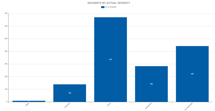
Category - Default
This is the default option. For lookup values, the system will display the categories in the display order in which it is rendered in the Forms.
Example screenshot of Incidents by Actual Severity sorted by 'Category - Default'.
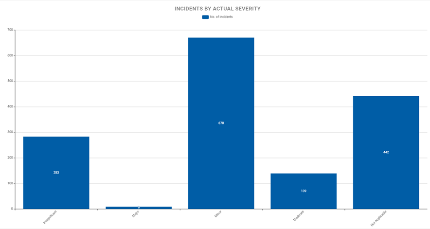
Category - Alphabetical
Selecting this option will do an alphabetical sort on the category.
Example screenshot of Incidents by Actual Severity sorted by 'Category – Alphabetical'.
Measure Values
This will sort the chart by the value of the measure.
Example screenshot below of the Incidents by Consequences sorted by descending order of the Incident count measure.
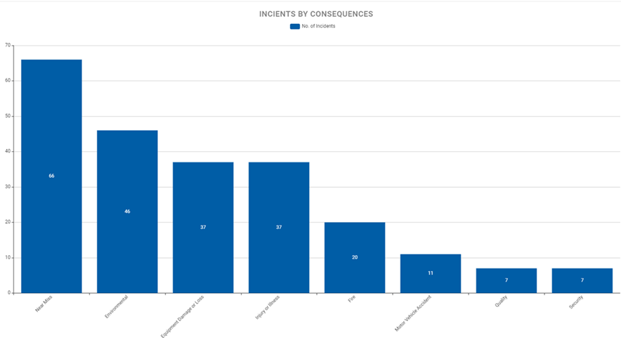
Applicable for Bar, Stacked Bar, Bar/Line, Heatmap and Line chart types.
|
Sort Order
|
- Ascending (default selection)
- Descending
Applicable for Bar, Stacked Bar, Bar/Line, Heatmap and Line chart types.
|
X Axis Label
|
Label for the horizontal axis
|
Y Axis Label
|
Label for the vertical axis
|
Number Tile Options
|
Background Color
|
Use HEX format (eg. #D2020E) or named color (e.g. blue) to define the background color for Number Tile.
|
Text
|
Use HEX format (eg. #D2020E) or named color (e.g. blue) to define the color for the text in a Number Tile. Will be automatically selected if left blank
|
Icon code
|
Use the four-character Font Awesome code (e.g. f4c4). Must be from Font Awesome version 5 (https://fontawesome.com/v5/search).
|
Translate
|
Translate To
|
Select the language. The language must have been set up in the system prior .
|
|
Enter the translation for the chart title.
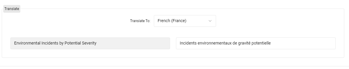
When a user with that locality using the defined language refreshes their browser.
|
|
