|
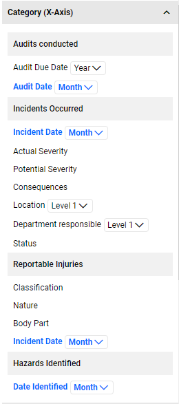
Category (X-Axis)
For every data source present, you will be displayed with the list of available fields that you can select to categorize your data. This field will be your X-axis for your bar/line/table charts. Where there are multiple data sources, it is logical to select the same type of field for the Category in all data sources.
If you are looking at trends by Month/Year, then select a Date field to be the Category in all your data sources or if you are looking at trends by Location, then select Location to be the Category in all your data sources.
For hierarchical component lookups, like, Location and Department, you will have to option to select the Level of the hierarchy. Selecting Level 3 for a location level would mean that the chart will return records at Location level 3 and its children.
The following field types are available for Category selection:
- Date fields
- Lookup fields -single and multi-select lookups
- Hierarchical Component Lookups -Single
- Component Lookups (where the Component is set to be used for Category/Dimension in Component Management)
- Status fields
- Questionnaire Name – this will be listed as 'Name' in the category
- Matrix fields - The Matrix results and the column/row axis values will be available for selection.
- For the Results, you can choose to display the Full value or Trimmed value. The default selection is 'Full'.
- Selecting 'Full' will display the Result as defined in the Matrix definitions. E.g., 01 – Low
- Selecting 'Trimmed' will display just the string value. E.g., Low
- The Matrix Axis and Result will be available as a Series.
You can edit your Category by simply clicking on a different available field in the Category list or you can hover over the section header and click on the x button to clear your selection.
At any point, you can go back and edit your data source to add in additional fields to your list view and it will be reflected in the Visualization editor.
Map
- Map charts are great for Location aware components or you can add in latitude/longitude to your data source columns.
- Map charts require a Google API key to be setup (in the Global settings).
Word Cloud
- An image composed of words used in a particular text field, in which the size of each word indicates its frequency or importance.
- When Word Cloud is selected as a Chart Type, the system will display a Keyword Fields section header which will list the fields that have language processing setup.
- You can increase the Number of Words displayed from 50 (which is the default) to 100 or 200.
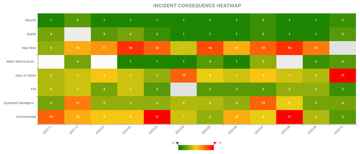
Heatmap
- When Heatmap is selected as a Chart Type, the system will display options for the Category (X-Axis),Category (Y-Axis) and Measures (Cells).
- The color mapping for the Heatmap will show a gradient of the colors defined in Advanced Options.
- The default color is a gradient scale of yellow, light red and dark red (#f6efa6, #d88273, #bf444c) which means that the cells with the lowest value will have a yellow background and the highest will have a dark red.
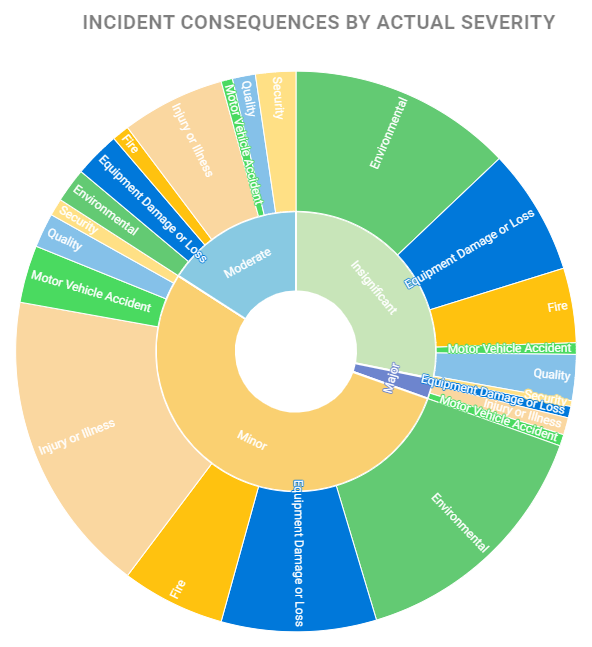
Sunburst
- Sunburst chart type is a multi-level pie chart with 2 levels of categorization and particularly useful to slice the main category into child categories to illustrate the relationship between them. Each circle is sliced by category values.
- When Sunburst is selected as a chart type, the system displays Inner Category and Outer Category section headers with the available fields (based on the data source columns) under each Category for selection.
- After selecting the Inner and Outer Categories, select a Measure and the system will render the Sunburst chart.
Gauge
- Gauge charts show a single value within a data range and is typically used to illustrate the progress towards a goal or a target.
- The Gauge chart requires 2 measures,
- Total Measure – this is the 'base' data. For example, the total number of Checks and Surveys issued.
- Actual Measures – this is the filtered data of your base. For example, the total number of Checks and Surveys that have been recorded.
- Typically, this will be setup as different data sources, one showing the total data and the other will be a filtered list. The result will show the proportion of the filtered data to the base data.
- The system will determine the color of the band dynamically based on the filtered results. The default gradient range is red, orange, yellow and green (#FF4747, #FF9A56, #FFE770, #79C67A).
- You can control the color fill by specifying your desired hex codes in the Color Palette (under Advanced chart options).
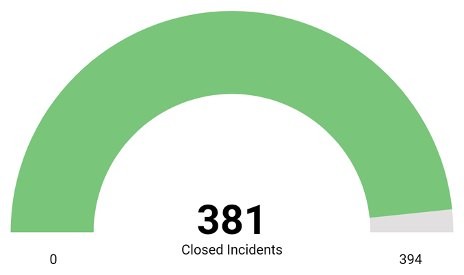
Note: The Actual Measure value must be less than the Total Measure value, otherwise the system will display an error message.
|
