|
Field Properties
I want to set the Field Properties, which define the Look and Feel of Fields
Each field on a page has a set of Field Properties, which you can use to fine-tune the look and feel. Some of these field properties are the same across all field types, others are unique to the individual field types.
Refer to Configuration of Mobile Forms for details specific to Roam.
Accessing Field Properties
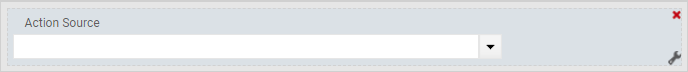
The field properties can be accessed by clicking on the wrench symbol, which is shown when you move your mouse over any of the fields:
Once you click on the wrench, the system will display a properties window like the following. This example is based on a lookup field:
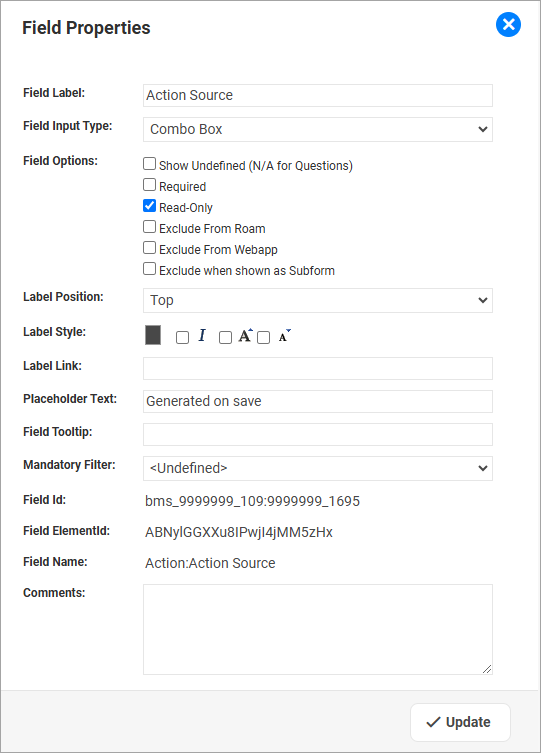
Field Properties
Some of the Field Properties are available for ALL field types, whereas others are specific to the current field type.
Field Type: ALL Field Types
|
For the task of ...
|
I need to ...
|
Changing the Name of the current Field
|
Update the Field Label.
To leave the Field Label empty in the web application, enter a blank space (" ").
If you do so, the system will identify this field in the other designer tools (e.g. Validation Designer) via the name of the underlying Component Field.
When you leave the field completely empty, the system will use the name of the Component Field also in the web application.
|
Making a field mandatory (this means a user must enter a value before the record can be saved)
|
Tick the Field Option Required
NOTE:
For Subform Fields, this option is not available. If a Subform should be mandatory, it is necessary to create a Validation.
|
Preventing a user from changing the value of a field, while they are still able to see its content.
This is often used for Defaulted Fields, for example "Date Raised".
|
Tick the Field Option Read-Only
|
Excluding the field from Roam or Web Application
|
Tick the box 'Exclude from Roam' and that field will not be available in Roam, any Form Actions or Validations configured on that field will not fire.
Tick the box 'Exclude from Webapp' and that field will not be available in the Web App, any Form Actions or Validations configured on that field will not fire.
|
Excluding a field when it is on a subform
|
Tick the box 'Exclude when shown as Subform' and the field will not be visible when the form is viewed as a subform.
This often allows a single form to be used both as a subform and standalone form, as the "link to parent" component lookup that is required on the standalone form, can just be hidden when the form is used as a subform, meaning you only need to maintain one version of the form.
|
Adjusting the position of the Field Label
|
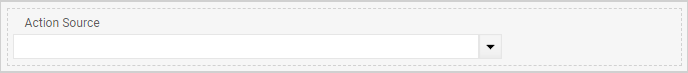
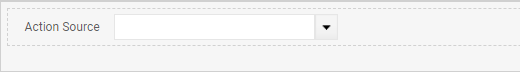
Select the required Position:
Top (default):
Left:
|
Adjusting Font Color, Style and Size
|
Make changes to the Label Style
|
Adding a Hyperlink to a Label - so that clicking on this label will take the user to the targeted site.
|
Add a correctly formatted URL into the field Label Link
|
Assisting the user with a brief instruction of what to enter into a field.
|
Add the text to be displayed into the field Placeholder.

The moment a user enters a value into the field, the placeholder will disappear.
NOTE:
If this field is left empty for DATE and TIME fields, the system will show the expected date/time format as the placeholder, for example DD/MM/YYYY
|
Assisting the user with additional information when the mouse is hovering over the field.
|
Add the required information into the Field Tooltip
|
Adding some comments to this field (which will ONLY be shown in the Form Designer, not in the Web Application
|
Add Comments
|
Field Type: Single Selection Lookups (other than Question [Yes/No] fields)
|
For the task of ...
|
I need to ...
|
Defining in which format the lookup is presented
|
Select the Field Input Type. The valid options are:
- Combo Box
- Radio Buttons - Across
(the individual items are listed left to right) - Radio Buttons - Below
(the individual items are listed top to bottom) - Single Lookup
(items are shown in a pop-up window)
|
Allowing, or disallowing the selection of the lookup item of "<Undefined>"
|
Under Field Options, make the required selection for the field Show Undefined.
|
Field Type: Question [Yes/No] fields
(In Component Management, you must have used the lookup obj.com.bmssolutions.QuestionYNonly)
|
For the task of ...
|
I need to ...
|
Defining in which format the lookup is presented
|
Select the Field Input Type. The options are:
- Checkbox (use only for Questions)
- Combo Box
- Radio Buttons - Across
(the individual items are listed left to right) - Radio Buttons - Below
(the individual items are listed top to bottom) - Single Lookup
(items are shown in a pop-up window)
|
Field Type: Multiple Selection Lookups
|
For the task of ...
|
I need to ...
|
Defining in which format the lookup is presented
|
Select the Field Input Type. The options are:
- Checkboxes - Across
(the individual items are listed left to right) - Checkboxes - Below
(the individual items are listed top to bottom) - Multi Lookup
(items are shown in a pop-up window)
|
Allowing, or disallowing the selection of the lookup item of "<Undefined>"
|
Under Field Options, make the required selection for the field Show Undefined.
|
Field Type: Text/Memo
|
For the task of ...
|
I need to ...
|
Defining in which format the lookup is presented
|
Select the Field Input Type. The options are:
- Single File/URL
(will result in a control from which the user can add a single File Link, or a URL). - Text - Multi Line
(will result in an entry field which can contain multiple lines) - Text - Single Line
(will result in a single line entry field). - HTML
This is a configurable field that will render simple HTML (e.g. bold/italic, lists). The 'Field Properties' are locked to be Read-Only and Exclude form Roam.
Data can only be imported into this field type. - Multiple Files/URL
(will result in a control from which the user can either select a File Link, or enter a URL).
NOTE:
Due to the ever increasing security limitations in modern browsers, we DO NOT recommend to use this control to attach Files via a Link to a Record.
|
Check the Spelling of the Field Content.
|
Under Field Options, tick the box for Check Spelling.
NOTE:
Spell Checking is not supported when a Text Field is in a Grid View.
|
Field Type: Number (Decimal Fields only)
|
For the task of ...
|
I need to ...
|
Applying padding with zeros to the decimal part of the number (for example: 3.0000, 3.100, 3.1200)
|
Check the field Pad Zeros.
|

|
For the Field Types listed below, it is possible to define Filters to limit the available selection.
To be able to select a Filter, it will be necessary to first define the corresponding Component Filters.
|
Field Type: Component Lookups
|
For the task of ...
|
I need to ...
|
Defining the content of the Component Lookup
|
You can select a Component Lookup for this field which is different to the Default Component Lookup (which is set in Component Management).
This also means that, for hierarchical Components, it is possible to represent a Component either as a List View, or as a Tree.
NOTE:
be aware that any filters applied to a List View will also be applied in this context.
|
Enabling direct access to a "Full Form" (instead of Quick View) for editing a related record.
|
Select the form which shall be used for editing the related record in the field Form for Direct Access.
When a Form has been selected, instead of the Quick View the system will open a "full form" in a new browser tab, so that the user can edit this record.
NOTE:
for this functionality to work, it is necessary that "smart URL" is enabled for the underlying Component.
|
Filtering the available items in this Component Lookup.
|
Define which Filter needs to be applied. The options are to apply:
- Mandatory Filter: the user will NOT be able to turn this filter off.
- Optional Filter: the user is able to remove this filter
It is possible to apply a Mandatory AND an Optional Filter.
|
Allowing Roam users to scan a QR code to select a record.
|
To enable Roam users to scan a QR code to select a record, rather than having to type and search, tick the flag Allow QR scan in Roam.
Once the flag has been set you must also select which field will be used to search for a record via the QR Code Target Field.
For example, a Person record could be selected by scanning the QR code representing either the Record Number, Employee Number or the Email Address.
 NOTES: NOTES:
- You need to make sure that the QR Code Target Field is a UNIQUE identifier for the current record.
- URLs as targets are not supported.
|
Field Type: Matrix
|
For the task of ...
|
I need to ...
|
Defining the Field Input Type for a Matrix field.
|
Designers can define if a Matrix shall be displayed either as
- Matrix - Sliders
- Matrix - Sliders (without Clear button)
this option will enable user to clear the Matrix field - Matrix - Lookups
|
|
To be able to select a List View to represent a Subform record, it will be necessary to first define the corresponding List View.
|
Field Type: Subforms
|
For the task of ...
|
I need to ...
|
Defining which List View should be used to represent the Subform records if they are shown.
- in their "collapsed" state
- as a Grid View
|
Select the List View which needs to be applied on this page.
|
Defining how a user can interact with the Subform records
|
Define the Subform Options:
- Allow Add New Record:
User can create new records for the Subform
- Allow Delete:
User can delete a record from the Subform
- Allow Select Existing:
User can select an existing record to add to the current list.
NOTE: the subform must be displayed as a legacy subform to support this function.
- Allow Inline Editing:
To allow users to edit supported fields (see below) on Subform records inline, i.e. directly from the Subform List View, select this option.
NOTE:
when Inline Editing is enabled, pagination will be disabled. Therefore, only select this option when you do not expect a large number of subform records, as performance could be affected.
- Show as Grid View:
The application displays the Subform records as a Grid View, and users can enter information in a way similar to a Spread Sheet.
Limitations for Inline Editing and Grid View:
Please note that both only support fields of the following types:
Text, Memo, Integer, Decimal, Date, Time, Single Lookup (Input Type must not be Radio Button) and Single Component Lookup.
- Show as Legacy Subform
Instead of a modal display, this subform will be displayed in the legacy style (in-line).
You MUST set this flag if you make use of any of the following configuration options:
- "Allow Select Existing" has been set
|
Filtering the available items in this Subform.
|
Select which Filter needs to be applied.
- Mandatory Filter: the user will NOT be able to turn this filter off.
|
Field Types: Questionnaire & Questionnaire Template Select, Walkthrough & Walkthrough Template Select
|
For the task of ...
|
I need to ...
|
Filtering the list of available/valid Questionnaires in a Business Process
|
For every Questionnaire Field or Walkthrough Field on a Form you can define a Filter, so the web application only display a subset of available Questionnaires. This filter is based on the Keyword which has been defined for a Questionnaire.
Two types of Keywords are available:
- Static:
this Keyword will ALWAYS be applied, regardless of the content of a Record.
- Field:
you can select a Lookup, Component Lookup or Text Field from the current form, and the system will evaluate the content of that field to determine the keyword.
Details can be found here.
- Condition:
you can define one or several Keywords, which will apply when a certain condition is met.
For example: when the Type of Permit is "Hot Work", apply the Keyword = HotWork
Some example conditions can be found here.
If multiple types of Keywords are defined, then the system will display Questionnaires which are matching ANY of the Keywords.
|
Only for Field Type Questionnaire:
Allow users to create related records (for example an Action) directly from a question.
|
Before you can follow the steps below, you may have to make some configuration changes as outlined here.
Once these conditions are met:
- Select the Related Record Subform
(Note: the list will show subforms within the form). - Select the Related Record Data Field
(Note: only text fields from the selected subform will be shown.)
|
Field Type: Map
|
For the task of ...
|
I need to ...
|
Linking the underlying control fields
|
Prior to linking the underlying fields to a Map Field, make sure that
- the fields representing Latitude, Longitude and Address are placed on the Form (either as visible or hidden fields)
- the Mapping Data field is not on the page.
Using field properties, select and link the Latitude, Longitude, Address and Mapping Data fields.
|
Displaying the map in the web application
|
Visibility is controlled by the flag Visible in Web App. If
- Selected: the map will be visible in the web application and in Roam
- Not selected: the map is only visible in Roam
|
Saving an Image of the Map as an Attachment
|
This is an optional configuration when you require a snapshot of the map as an image attached to a record.
- Add a 1-1 Relationship to obj.com.bmssolutions.DBFile using the Component Management tool
- Select this relationship in the Map Image Field
Once set up, each time the map is modified the system will automatically take a snapshot of the map and save it as a PNG image to the above configured relationship field.
The image naming convention is
<Parent Record AutoNumber>_<Current Date in yyyyMMdd format>_<Time in HHmm format>,
e.g. INC-0000010_20211201_1505.png
|
Creating a new record directly from a Form Map on an existing record
|
This is an optional configuration when you require to create new records from an existing Form map.
The steps required are:
- Open up the 'source' form in the Form Designer, edit the Map Data Field Properties and click on 'Map Record Creation Configuration'.
- Click 'Add Component Details', and then select the Target Component, Latitude, Longitude and Map Field (optional)
On successful setup, you will be able to right click on a location in Form map and a 'Add <Component Name>' context menu is rendered. On clicking the 'Add..' menu item, the system will pre-populate the co-ordinates in the new record. If 'Map Field' is setup, the system will pre-populate the map type and zoom level.
Note: no links will be established between the 2 components as part of this setup.
|
Determining the means by which user can place a Pin on a map and determining an address/location.
|
By design choices, and via security settings it is possible to control the means by which users can interact with the Map field.
When a user places a pin on the map by either
- a mouse-click
- using the Google search field to enter and select an address
the system will update all of the control fields, using the Google API (latitude, longitude, address, map data [info like zoom level, display type, ...]).
Another option to place a pin is to provide both the latitude and longitude, either manually through the web application or via import. Upon saving/viewing the record, the system will
- place the pin and the defined location
- but will NOT update the address field - the address will need to be provided manually using this method.
Given the above, designers can control the level of interaction by showing, hiding or defining the access rights to those control fields.
|
Field Type: Free Text
|
For the task of ...
|
I need to ...
|
Adding and formatting free text
|
Enter the required text in the text box, and use the formatting tools as necessary.
|
Adding a Hyperlink to another Web Site.
|
Click on the Link symbol, and define the link like in the following example:
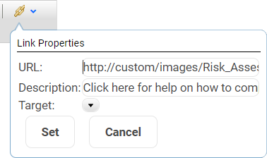
Once all the information is entered, click on SET to save the information.
|
Adding an Image
|
Click on the Image symbol, and define the link like in the following example (linking to a local file):
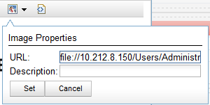
Once all the information is entered, click on SET to save the information.
|
Linking to a URL or File which is in your local environment, rather than on the internet.
|
If the information you are linking to is within your company network, on a File server, then you need to use the following format:
- file://<server_name>/<folder>/<file.name>
- Example:
file://14259w8d/Company/Logos/company_logo.png
|
Field Type: Label
|
For the task of ...
|
I need to ...
|
Displaying the content as a Header, or as a Note
|
Select the type of label. Headers will be displayed more prominently, using a bold character set.
|
Applying client specific formatting
|
Optional: clients can apply their own formatting via CSS changes. This will require to create a new CSS class in the custom.css file, and referencing it in this field.
|
Adding text
|
Enter the text to be displayed in the field Display Text.
|
Field Type: Rich Link
|
For the task of ...
|
I need to ...
|
Defining the content to be displayed
|
Enter a Title and Summary to label and describe the link.
|
Include an icon in the field
|
Provide the code for the desired Icon
To define the icon:
- Navigate to the following URL: https://fontawesome.com/search?s=regular
- Scroll for or search for an icon
- Click on the icon of choice
- Copy the Unicode - e.g. f03d for a 'video' icon
- Use that code as the Icon Code
|
Creating a static link
|
Enter a link such as www.evotix.com
|
Creating a dynamic link
|
Select the "Data Field" that will store the URL.
You can set the URL in the data field via Analytics Rules, Set Field Actions or an API
|
Applying client specific formatting
|
Additional CSS Class: clients can further refine the look and feel for this field by providing a CSS class.
|
Field Type: Suggestion Assistant
|
Refer to Artificial Intelligence to understand more about using Suggestion Assistant in forms
|
Field Type: SDS Lookup
|
For the task of ...
|
I need to ...
|
Integrating with SDS Manager to retrieve Safety Data Sheets for a Chemical
|
- Add the [SDS Lookup] widget on the form
- Setup the Field Mapping Configuration, refer to SDS Manager Integration for more information
|
Note: SDS Manager Integration involves an activation process and attracts a licence fee. This functionality is available only for Evotix Hosted Clients
|
Field Type: Multi File Drag Drop
|
For the task of ...
|
I need to ...
|
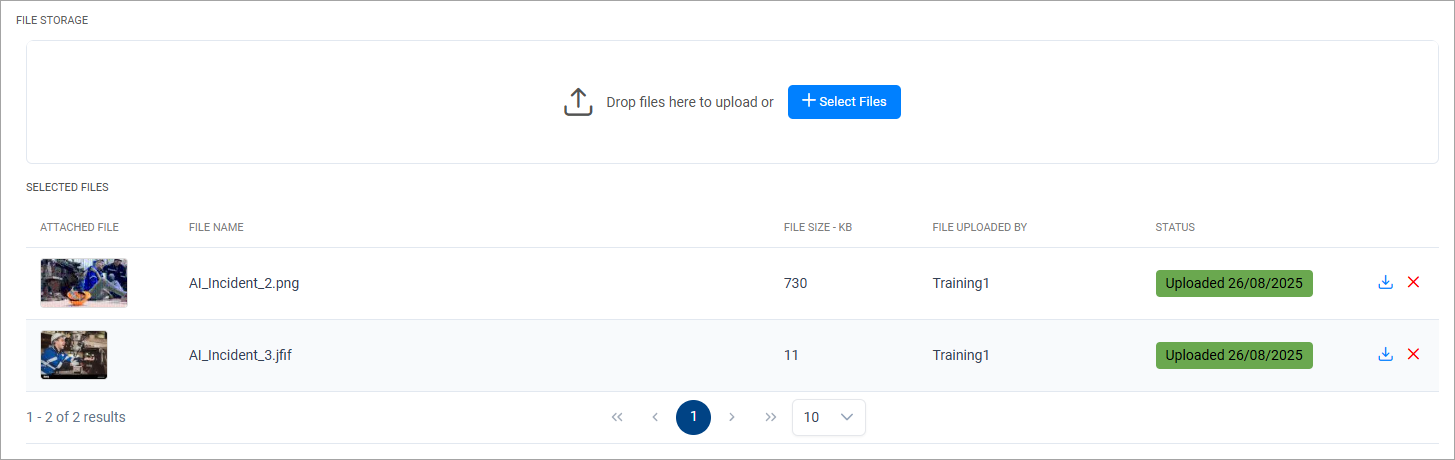
Adding a file widget to a form that allows to drag and drop (or attach) multiple files at a time.
|
- Drag the [Multi File Drag Drop] widget to the Form from Form Elements.
- Drag the relationship to the “File Storage” component onto the widget and save the form.
This will render the File widget as below in the form allowing users to attach multiple attachments at a time.
|
Field Type: System Image - Dynamic
|
For the task of ...
|
I need to ...
|
Displaying a image dynamically in a form
(ie. the System Image(s) to display is controlled by the data in the form)
|
- Add the [System Image - Dynamic] widget to the form
- Specify the Field label
- Define a Max height (in pixels). The recommended height is 85 pixels
- Select a 4000 character text field in the [System Image File Names to Display] that will hold the names of the System Files to display. Only image files are supported.
You can display multiple images separated by comma - The actual images are stored in (Admin
 System Files) System Files)
|
An example for use of dynamic images is in the Chemical Register form where based on the chemical, different GHS Pictograms are displayed.
|
Field Type: System Image - Embedded
|
For the task of ...
|
I need to ...
|
Displaying a dynamic image in a form
(ie. the image is embedded in the form and is displayed on every record)
|
- Add the [System Image - Embedded] widget to the form
- Specify a Field Label
- Define a Max Height (in pixels). The recommended height is 85 pixels.
- In the [Image to Display], select the System File (image) that needs to be embedded in the form.
- New image files can be added (and existing images can be updated) by navigating to Admin System Files System Files Admin. Only the system files that are 'Images' will be available in the selection list.
|
|
